Make the decision clear
A financial interface can look simple and still be difficult to understand. The amount needs a currency. The balance needs a date. A confirmation needs to explain what happens next. Those details are the design.

Give every screen a question
Before arranging a screen, write the question it needs to help someone answer. What am I looking at? What has changed? What happens if I continue? A page that tries to answer everything at once can make the next decision harder to see.
Place the information needed for that decision together. Use supporting detail to explain it, and make the route to that detail easy to find. Progressive disclosure works best when the first layer remains meaningful on its own.
Your accounts
Account name
Available balance
Last updated
Language is part of the interface
A label, an empty state and a confirmation message are all pieces of product design. Use the same term for the same thing. Explain specialist language where it appears. Describe an action in a way that helps a person anticipate its consequence.
Consider a cost comparison. A monthly amount beside an annual amount is easy to misread, even when both numbers are correct. State the period, currency and assumptions beside the figure. Keep the units consistent, and make missing information visible instead of filling the gap with a reassuring phrase.
Review the details
Recipient and amount
Fees and currency
Expected arrival
Design the whole decision
Think beyond the moment of confirmation. A person may need to revisit a choice, find a record or explain an outcome to somebody else. The receipt, history and support experience are part of the same journey.
Review the design using realistic questions and incomplete knowledge. Can someone find the information they need? Can they explain what will happen next? These are useful design questions before colour, motion and polish enter the conversation.
A record to return to
Current status
Reference number
Get help
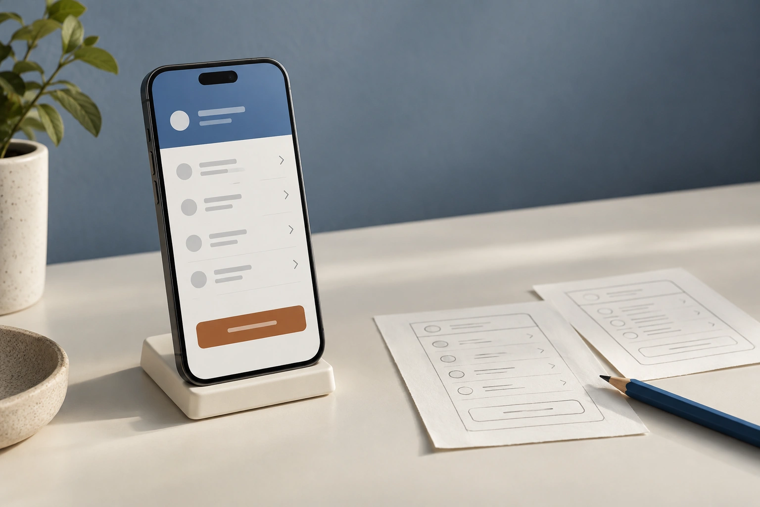
From the first sketch
Test the words and the sequence while the design is still a sketch. A person should be able to explain what they are looking at and what happens next.
What we build ↗